Case study · Arts & culture · Mobile
In a Memory Palace
A mobile app for an art exhibition about migration, where anyone can donate a photo, a video or a voice recording of their family's story, without an account, and find it again among everyone else's.
At a glance
- The problem
- The exhibition needed a way to collect families' migration stories, from story circles before it opened to visitors scanning a QR code during it, with legal consent for every contribution.
- What I did
- Designed the mobile app solo, from the user flow and lo-fi wireframes to the style guide and hi-fi screens for consent, sharing and the gallery.
- The result
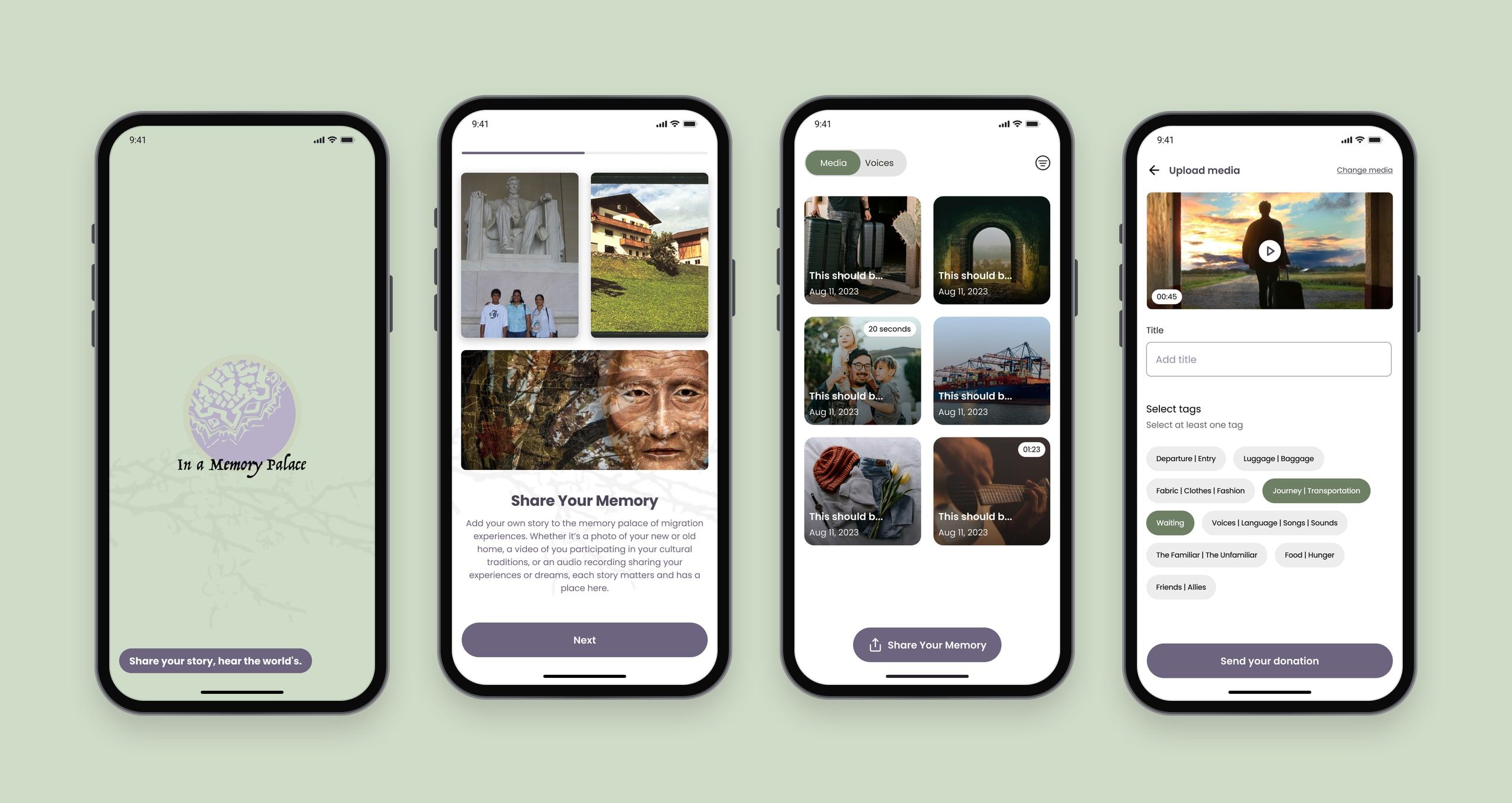
- A complete design for donating a story in a few taps, without an account, and with consent built into the first run.
Project timeline
- User flow, information architecture and lo-fi wireframesWeek 1
- Style guide, hi-fi screens and prototypeWeek 2
The brief.
In a Memory Palace is a production by Theatre Nohgaku, with the University of the Incarnate Word (UIW): a meditation on displacement, both the physical displacement of refugees, immigrants and others who make new lives far from home, and the displacement of fragmented memories.
Alongside the performance, the team planned an art exhibition in San Francisco and San Antonio. They wanted people to donate sounds and images about their own families’ migration, such as songs, photos and stories, through a phone app. The contributions would be curated and projected in the exhibition, so the “memory palace” could keep growing.
What the brief asked for.
The client’s requirements set the shape of the app before any screen was drawn:
- No accounts, but real consent. People wouldn’t sign up, but every contribution needed a signed legal permission form covering how the material would be used.
- Two ways in. Small story circles before the exhibition, and visitors scanning a QR code during it, so the app had to work for a first-time visitor in a few minutes.
- Sixteen categories. Every donation belonged to themes such as departure, luggage, waiting, voices and family, so contributions could be organised and curated.
- Discovery by chance. People could see and hear contributions in the gallery and the exhibition, but not search for a specific person’s donation.
Design process
- 01
Research & UX
- User flow
- Information architecture
- Lo-fi wireframes
- 02
UI design
- Style guide
- Visual inspiration
- Hi-fi screens & prototype
One flow for every story.
I mapped the user flow first, to make sure the app served its purpose of collecting and sharing migration stories before designing the look. The welcome screens lead to consent, then home. From there, sharing is one path that splits only where it has to: voice or media.
- Home
- Donate a story
- Upload screen
- Voice or media?
- Record your voice
- Add a title & tags
- Upload a photo or video
- Add a title & tags
- Media gallery
Wireframes first.
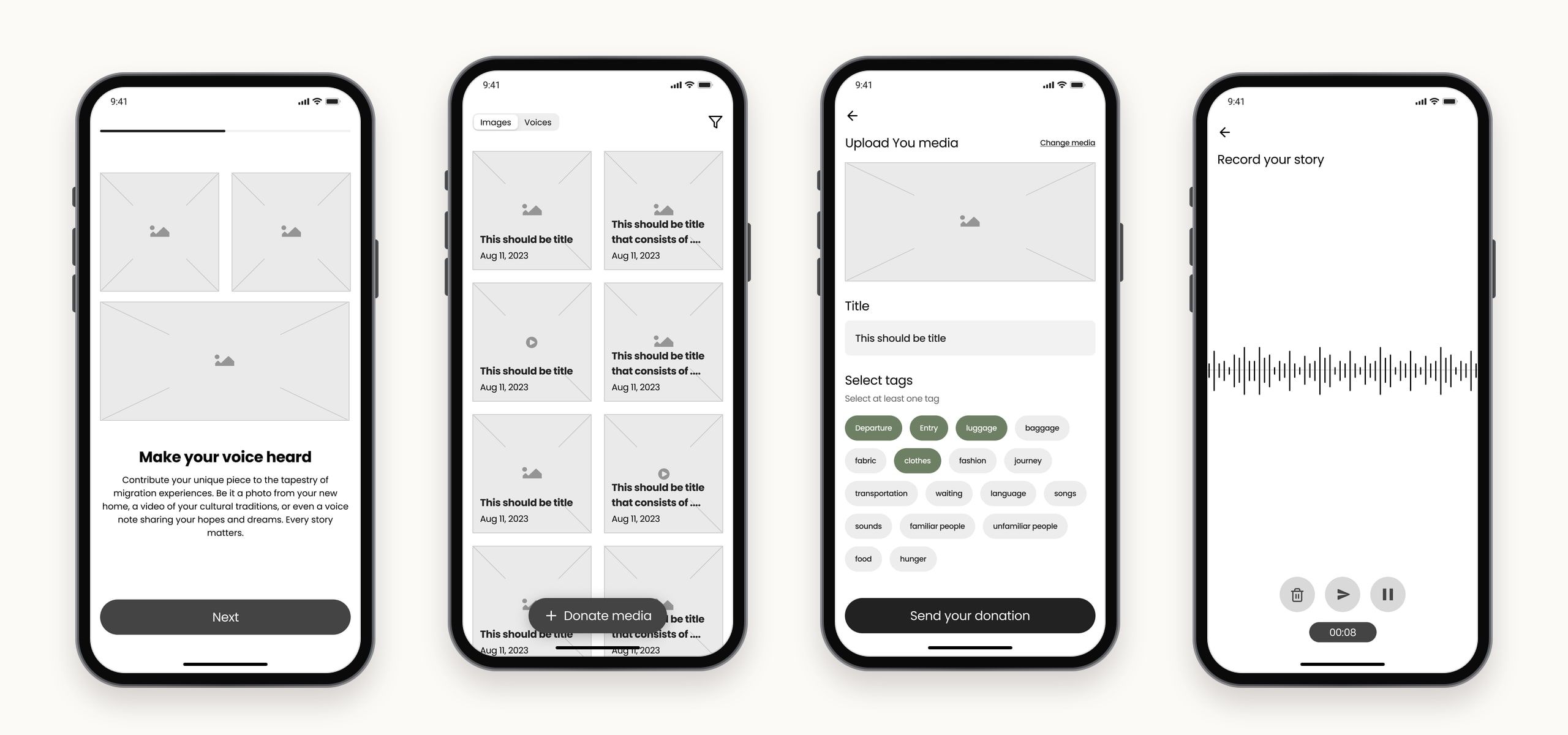
Lo-fi wireframes tested the structure before any visual design: onboarding, a gallery split into images and voices, uploading with tags, and recording a story.
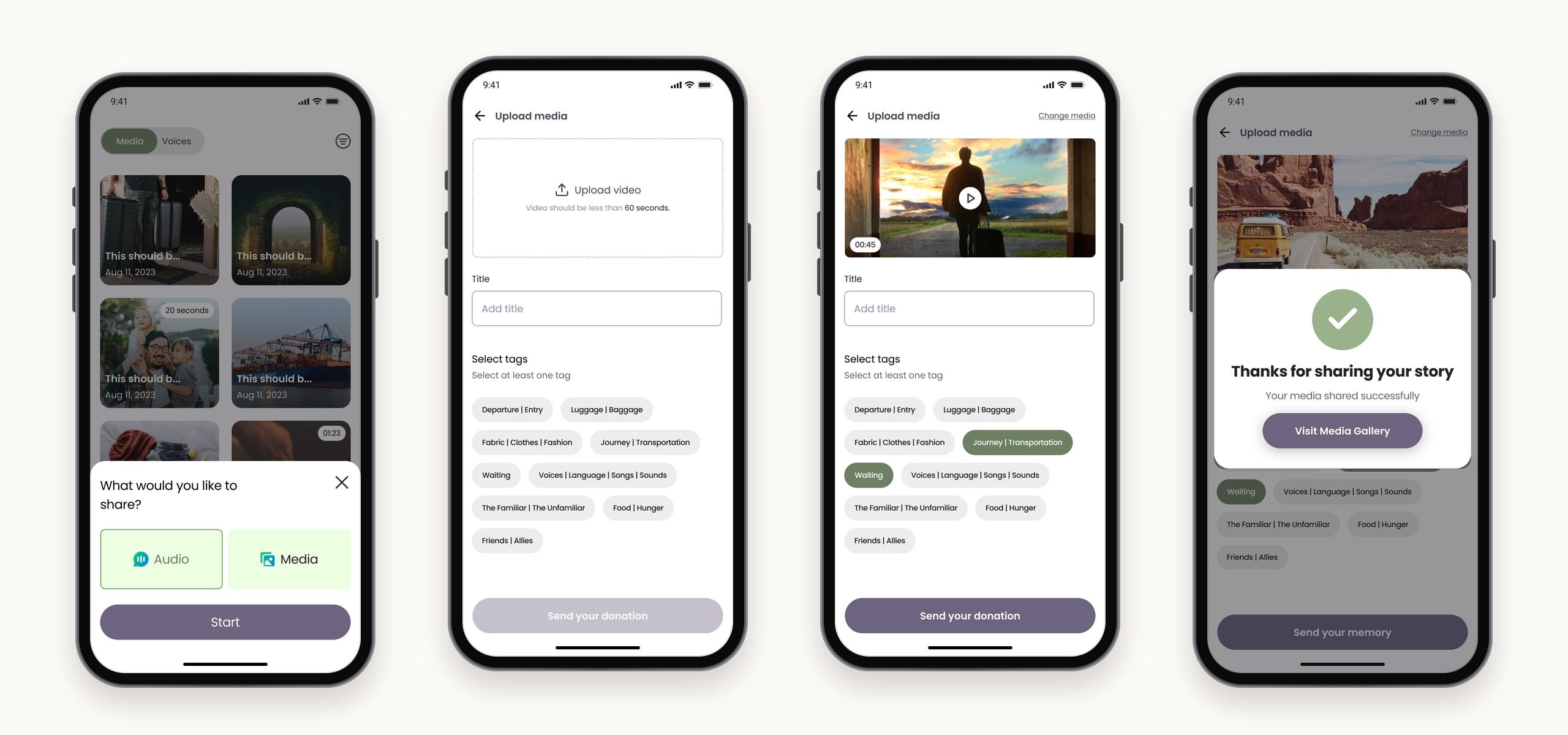
Moving to hi-fi changed two things. The brief’s sixteen single-word categories became nine grouped tags, such as “Departure | Entry” and “The Familiar | The Unfamiliar”, which are quicker to choose and closer to how people describe a journey. And the plain “Image or video / Voice” choice became two clear cards, Audio and Media.
A look borrowed from the stage.
The visual language comes from the production itself: its layered artwork of faces, maps and leaves, and its costume sketches. A soft sage green and a muted lavender carry the calm, reflective tone, with darker shades for text and buttons.

Colour and type.
Two families, sage and lavender, each run from near-black to white, with red, amber and teal kept for errors, warnings and success. Poppins sets everything, from 40px headings to 12px captions.
Sage
- #252B21
- #4D5946
- #6E8064
- #9AB28C
- #BBD9AA
- #CFDCC8
- #FFFFFF
Lavender
- #24212B
- #4D4659
- #6D6480
- #998CB2
- #BAAAD9
- #B8B0C8
- #FFFFFF
Status
- Error#CC3229
- Warning#D67200
- Success#078C64
Poppins
Typeface
- RegularMake your voice heard
- MediumMake your voice heard
- BoldMake your voice heard
Purpose and consent first.
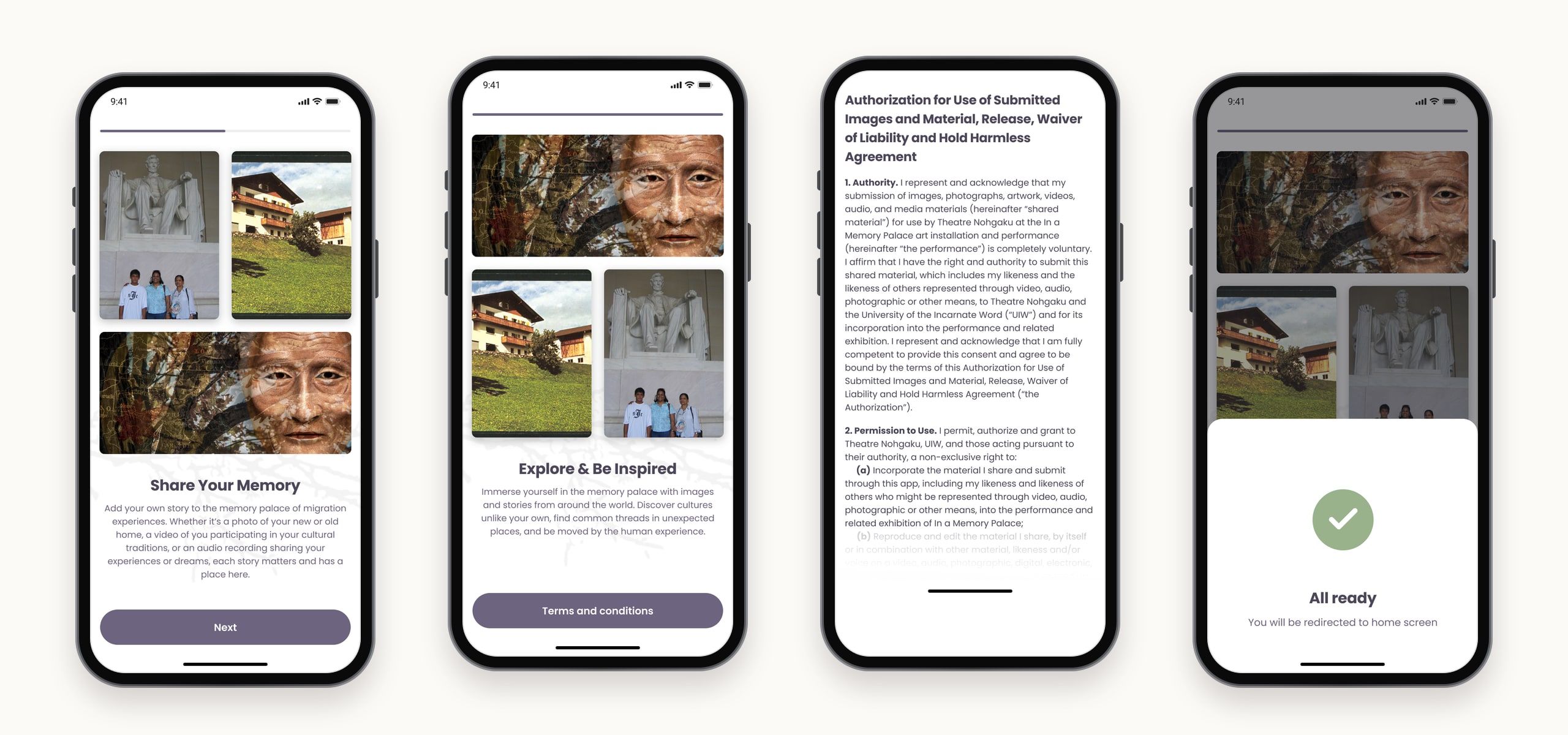
The onboarding screens do two jobs: explain what the app is for, and get consent for the app’s privacy terms. Two short screens, Share Your Memory and Explore & Be Inspired, set the purpose with real images from the project. The release form follows, and once it’s accepted, the app gets things ready and moves people to the home screen.
Explore by chance.
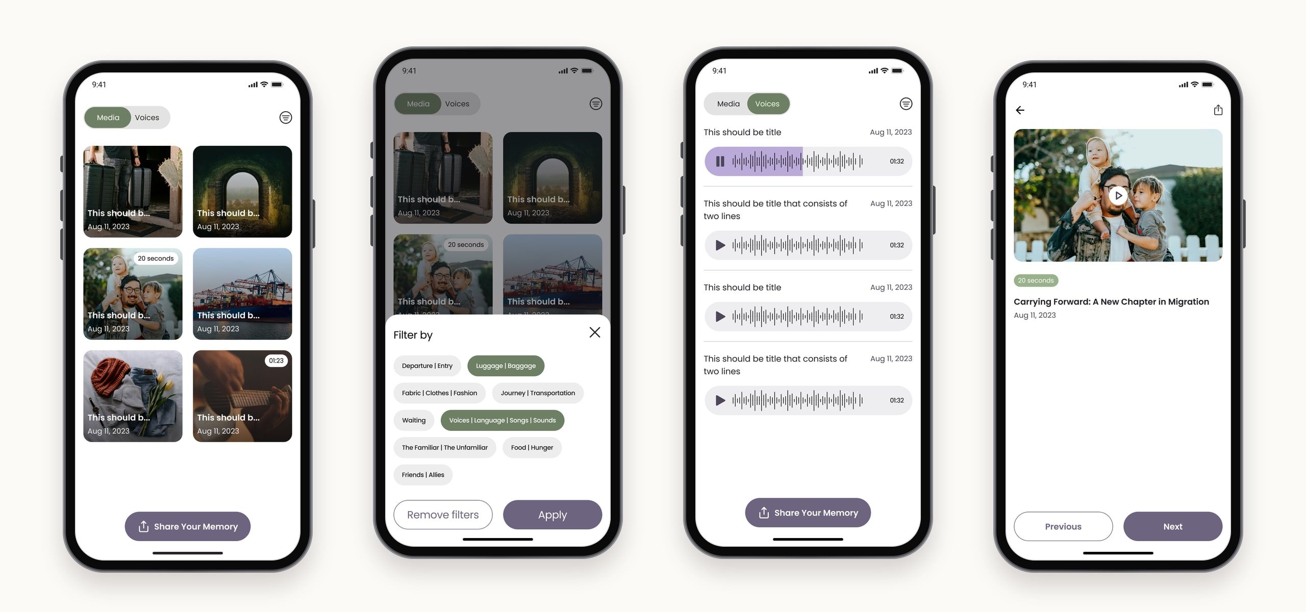
The gallery has two tabs, Media and Voices, and a filter by the same tags people use when they share. There’s no search for a specific person, because the brief wanted people to come across stories, not look them up.
Share in a few taps.
Sharing starts from one button. People choose Audio or Media, upload, add a title and at least one tag, and send. The confirmation thanks them and points to the gallery, where their story now lives among everyone else’s.
Or just tell it.
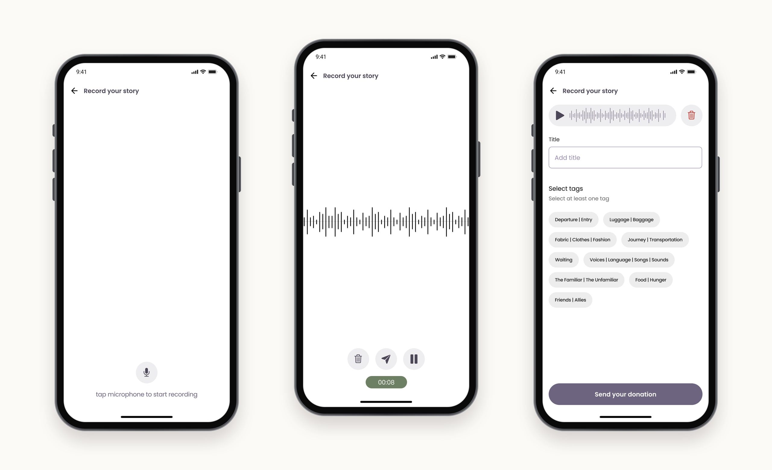
Some stories are easier to say than to show. Recording a voice note takes one tap on the microphone, with pause and delete while recording, then the same title and tags as any other donation.
Final notes
This project asked people for something personal, a photo of a home they left or a song from their family, so the design had to earn that trust before asking. Putting the purpose and the consent form first, and keeping sharing to a few taps without an account, came straight from that. Grouping the brief's sixteen categories into nine pairs and themes was a small change with a big effect, because it made tagging feel like telling a story rather than filing one.