Case study · EdTech · Mobile
MyAUC
Bringing campus life at the American University in Cairo into one official app, designed and built in OutSystems.
At a glance
- The problem
- Students, faculty and staff were juggling scattered platforms for everyday tasks, and campus guests struggled to find their way and the right contacts.
- What I did
- Led the UI/UX with AUC's UX team across 200+ screens and 11 modules, and built the components and theme in OutSystems.
- The result
- Live on iOS and Android with 10K+ downloads on Google Play. The home screen was chosen by A/B testing, where 59% of 106 students picked the winning design.
Project timeline
- Problem statements and design strategyJun–Aug 2022
- Information architecture and user flowsJun–Nov 2022
- Lo-fi and hi-fi wireframesSep–Nov 2022
- Visual design and prototypeSep 2022 – May 2023
- UI components and custom themeDec 2022 – Dec 2023
- A/B testing and implementing feedbackMar – Dec 2023
The problem.
The goal of the new AUC app was to meet each group’s daily needs through one digital front door, with a fresh look and feel tailored to people’s interests and profiles.
Before it, campus life was spread across platforms, and each group felt it differently.
Students
Moved between platforms to get a single task done, and wanted to schedule food orders and pick them up when they’re free instead of waiting in line.
Faculty & staff
Struggled to manage tasks, reach online forms, check their schedules, and keep track of work information like holidays and payroll.
Guests
Found it hard to navigate the campus and to find the right office to contact.
The solution.
One university app that brings resources from every platform together, with simple navigation and a module for each service:
- Campus navigation, with a map, directions and real-time bus tracking.
- Task management, with to-do lists, reminders and scheduling.
- Online forms, categorised so the right one is easy to find.
- Notifications for important events and announcements.
- Personal profiles, so each person sees what’s relevant to them.
- Integration with existing university systems, keeping data in sync.
Design process
- 01
Problem & solution
- Problem statement
- Design strategy
- 02
Ideation & sketching
- Information architecture
- User flow
- 03
Wireframing
- Lo-fi wireframes
- Hi-fi wireframes
- 04
UI design & prototype
- Visual design
- Prototype
- 05
Feedback & testing
- A/B testing
- Implementing feedback
- Weeks
- 48+
- Screens
- 200+
- Modules
- 11
Tools used
- Figma
- Adobe Illustrator
- Miro
- Google Docs
- Google Sheets
- Microsoft Teams
- Jira
- Slack
What we learned.
- One app had to serve very different people. Students, faculty, staff and guests each needed a different set of services, so the app couldn’t show everyone the same thing.
- The home screen had to be personal. Not everyone needs every service every day, so each person’s most-used modules had to be within reach, with the rest a tap away.
- The look had to win people over. In an A/B test of three home screen designs with 106 students, design C was the clear favourite (59.4%), ahead of B (38.7%) and A (1.9%).
Mapping the app.
I created the user flow and information architecture in Miro to show how people would move through the app and its modules. AUC members sign in and go through onboarding, guests register with a one-time code, and everyone lands on the same personalised home screen.
- Install & open app
- Log in
- AUCian or guest?
- Onboarding
- Select modules
- Customise actions
- Reorder modules
- Enter name & email
- Verify with OTP
- Profile
- Notifications
- Quick actions
- Contacts
- Buses
- Dining
- Forms
- Academics
- Navigation
- Library
- Health
Wireframes.
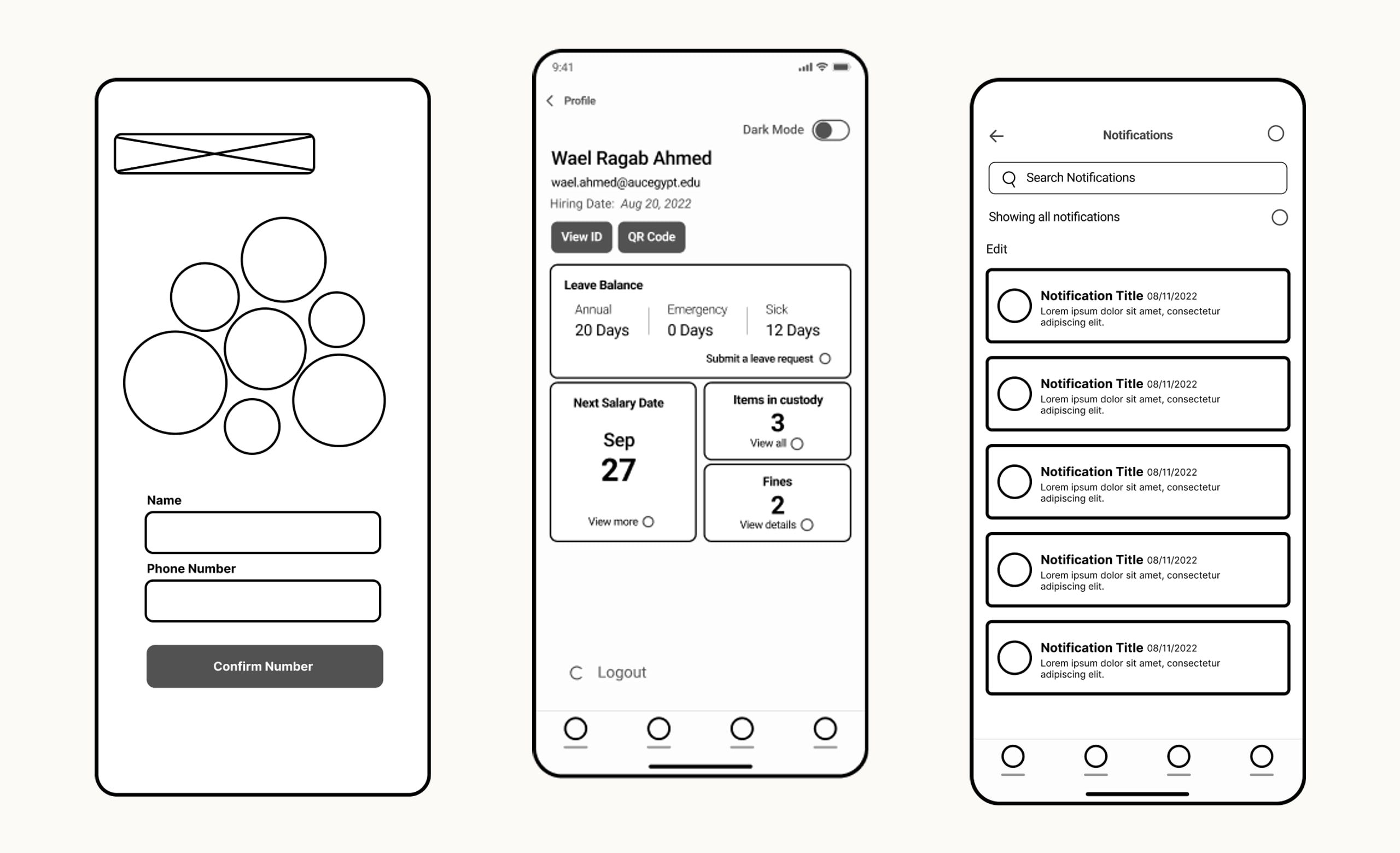
Lo-fi and then hi-fi wireframes set the structure of each flow before any visual design: here, signing up with a name and phone number, the faculty and staff profile, and the notifications list.
Every service keeps its own colour.
Choosing a colour palette was tricky. MyAUC brings together many services, and each one already has its own brand colour at the university, so those colours had to be used as they are. I gave every service its colour and used the app’s primary blue to keep the whole experience consistent.
Primary
- #0F385A
- #1D6DAF
- #50A0E2
- #A8CFF0
- #D3E7F8
- #E9F3FB
- #F6FAFE
Greys
- #222222
- #4D4D4D
- #808080
- #B3B3B3
- #E6E6E6
- #F2F2F2
- #FFFFFF
Service colours
- Contacts#8DB938
- Buses#FEC34E
- Health#00A9A3
- Navigation#0083AD
- Forms#AB218E
- Dining#F15B4E
- Library#E8CFA0
The spirit of AUC's architecture.
We worked to bring the spirit of AUC’s architecture into the app, especially on the home screen. A triangle, a shield and a crescent drawn from the campus buildings combine into the app’s visual language.

Typography.
The interface uses two typefaces, Roboto and Cairo, each in light, regular and bold.
Roboto
Typeface
- LightTell us what services you want to see on your home screen!
- RegularTell us what services you want to see on your home screen!
- BoldTell us what services you want to see on your home screen!
Cairo
Typeface
- LightTell us what services you want to see on your home screen!
- RegularTell us what services you want to see on your home screen!
- BoldTell us what services you want to see on your home screen!
Testing the look before building it.
We ran an A/B test with 106 students and 26 staff to see how they felt about three different looks for the home screen. Both groups preferred the third design, which we applied with slight layout changes for development and accessibility constraints.

Onboarding
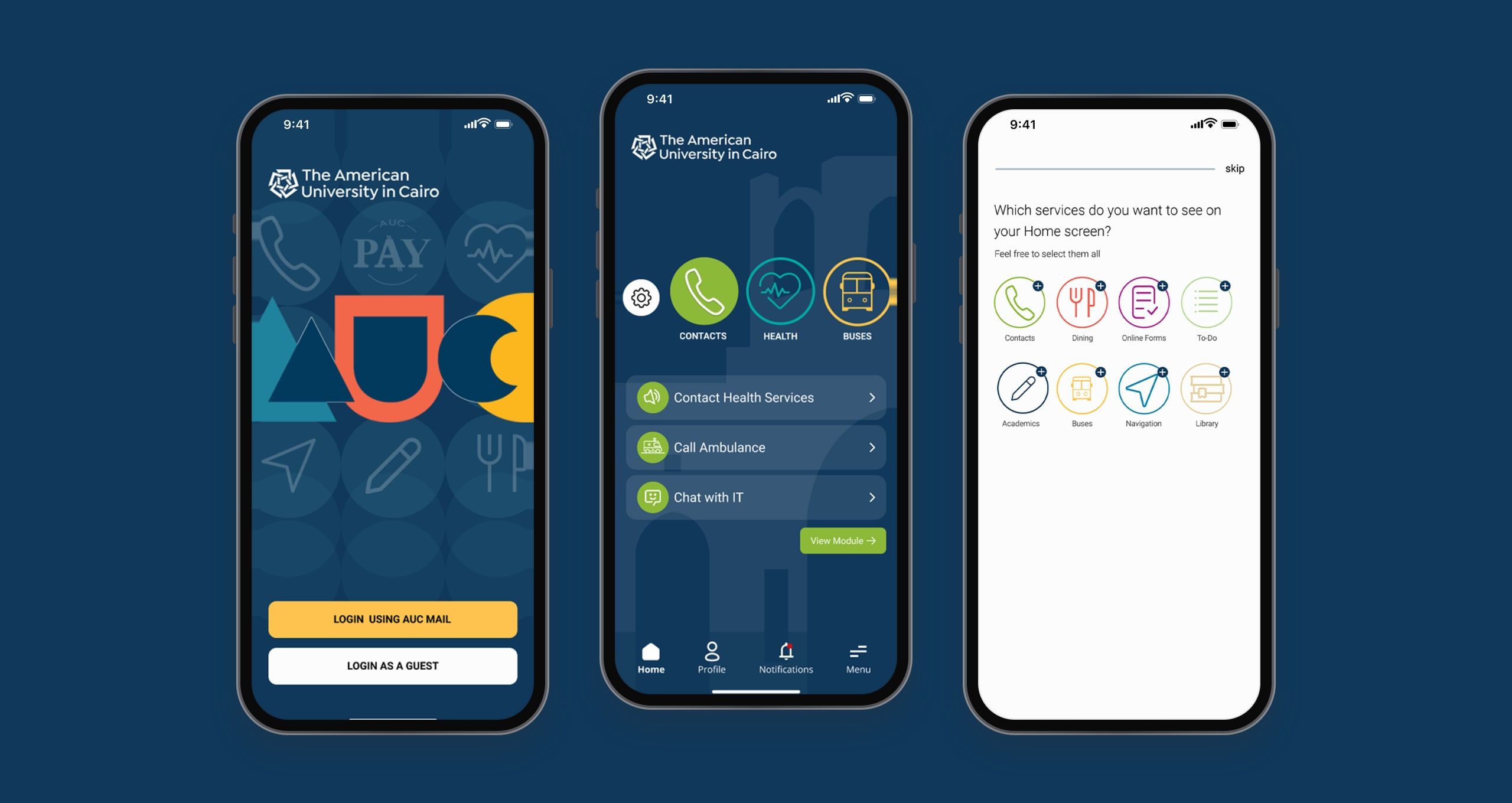
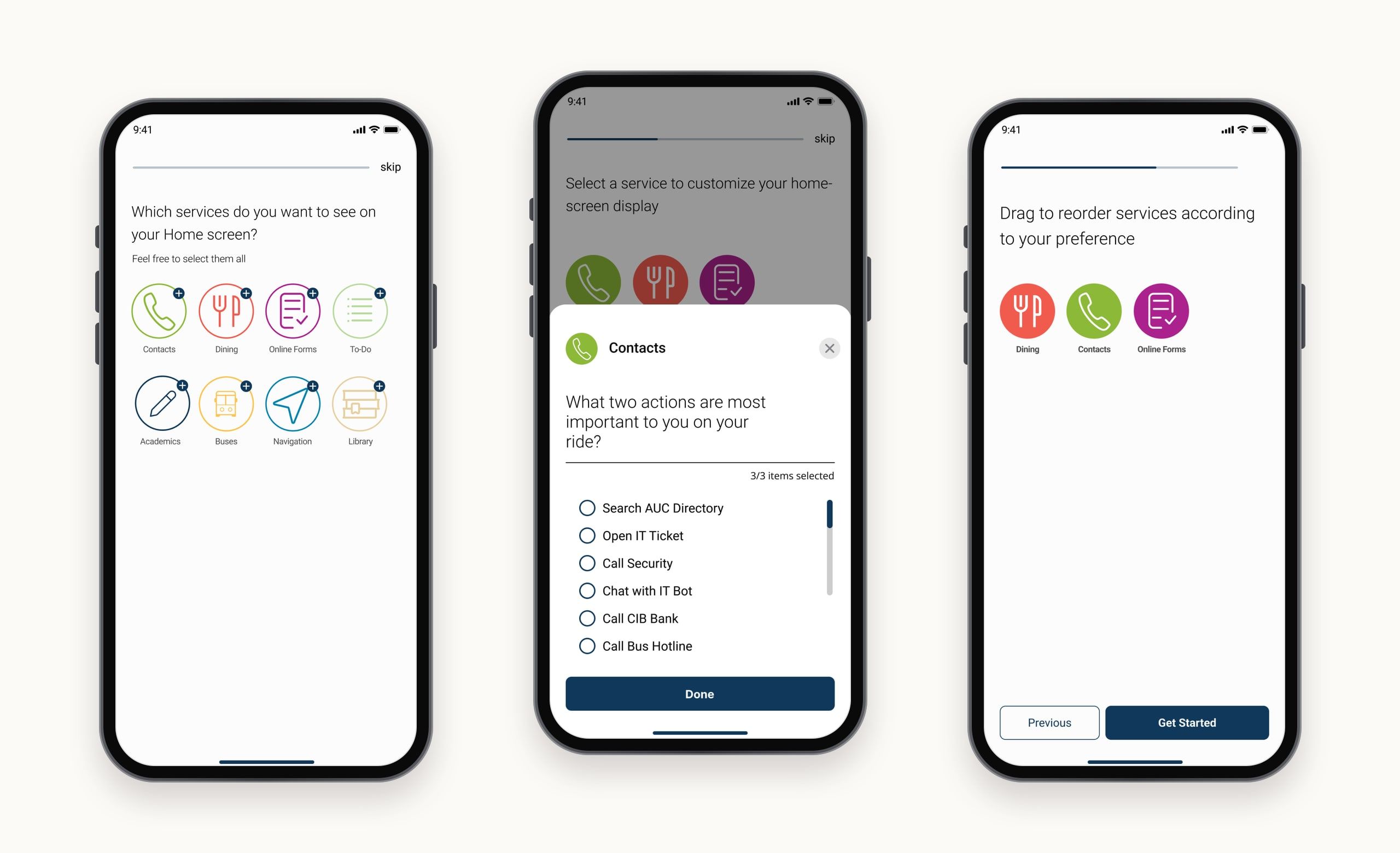
Onboarding asks people to choose the modules they’ll use regularly. Every module also has quick actions and a piece of information that can sit on the home screen, so people choose those too.
If someone skips onboarding, every module appears on the home screen with its default actions and info.
Home & side menu
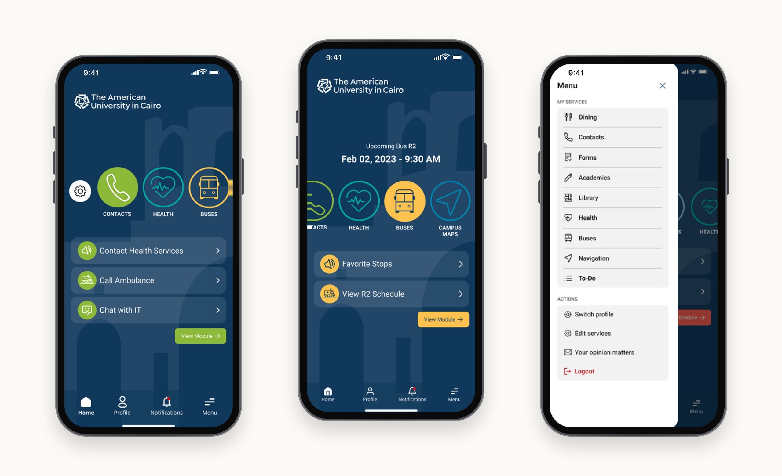
The home screen shows each person’s preferred modules. Selecting one reveals its key information and quick actions, without opening the module.
The side menu reaches every module from anywhere in the app, both the preferred ones and the rest. Each module’s quick actions are two taps away, with no trip back to the home screen.
- Access preferred modules from the home screen.
- See a key piece of information without opening the module.
- See notifications from AUC admins or triggered automatically.
- Open a profile tailored to each persona: students, faculty and staff.
- Edit preferred modules and customise their quick actions.
- Contact AUC’s IT department, or log out and come back at any time.
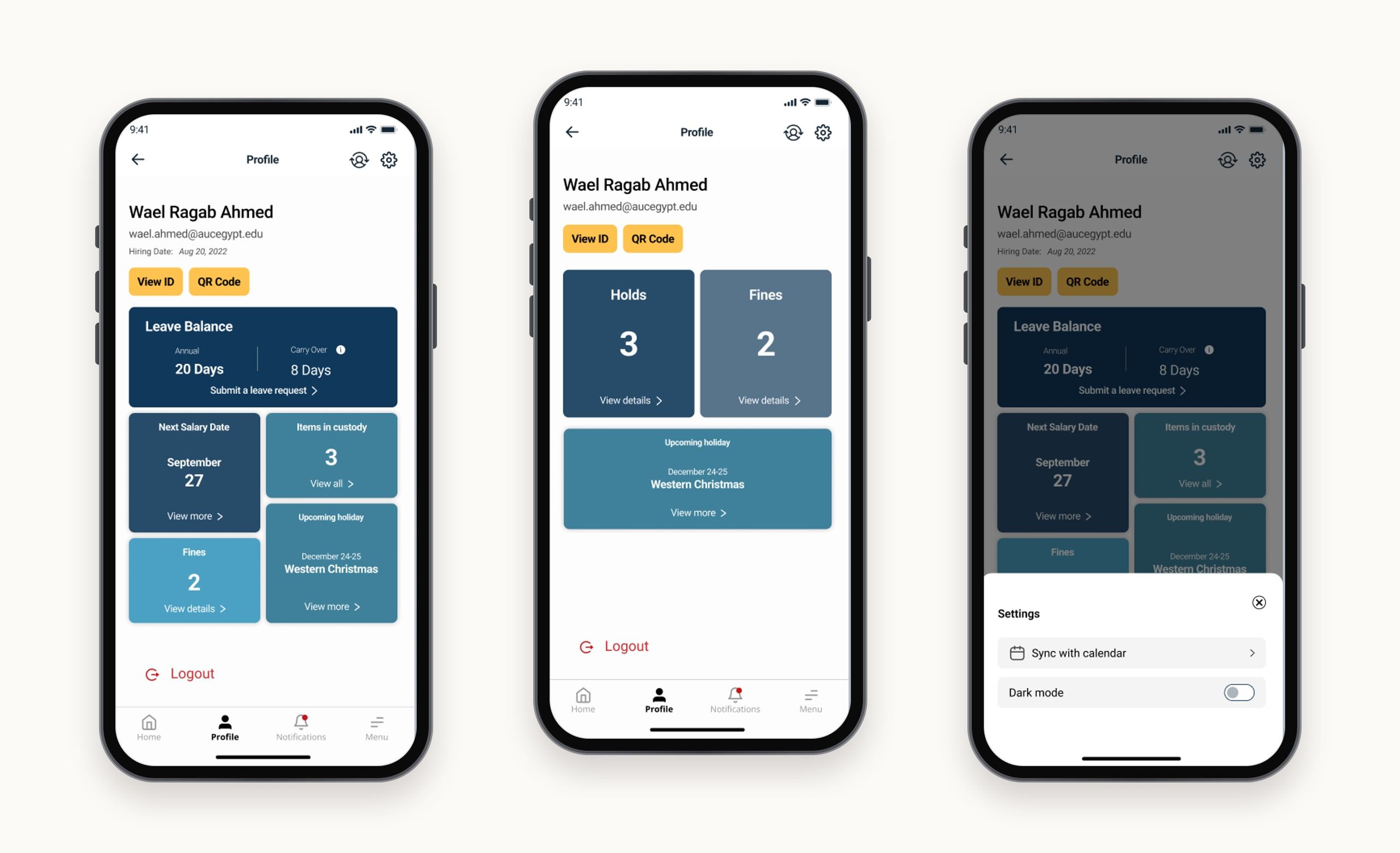
User profile
Each persona gets a profile with the information that matters to them.
- Faculty & staff: leave balance, payroll, items in custody, and upcoming holidays and closures.
- Students: university holds, such as registration or financial holds, so they can deal with them promptly.
- Everyone: settings for preferences, notifications and privacy, library fines, and their university ID with a QR code.
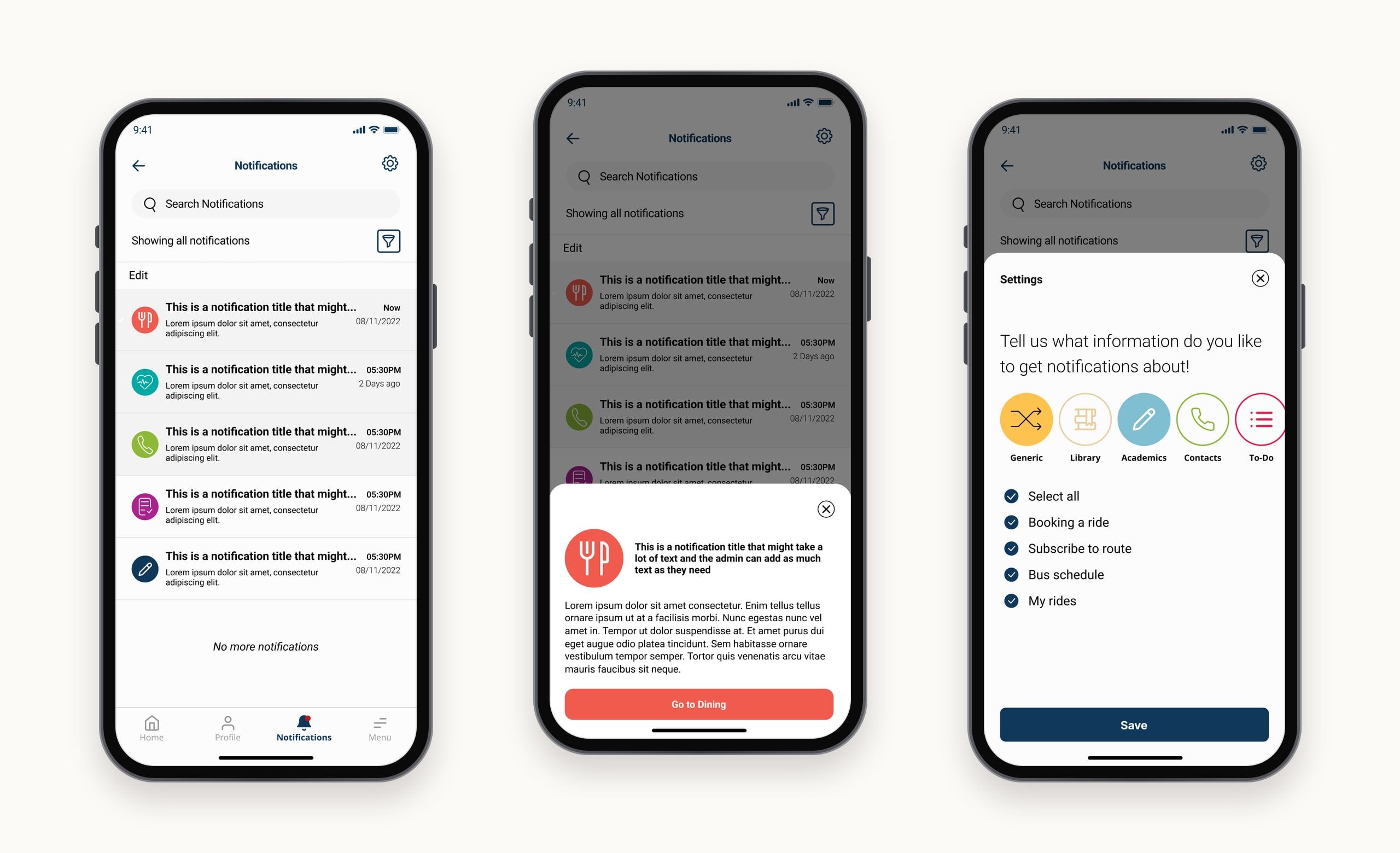
Notifications
People choose the topics they want to hear about in notification settings.
- Mark notifications as read.
- Search for a specific notification.
- Filter by date, category or importance.
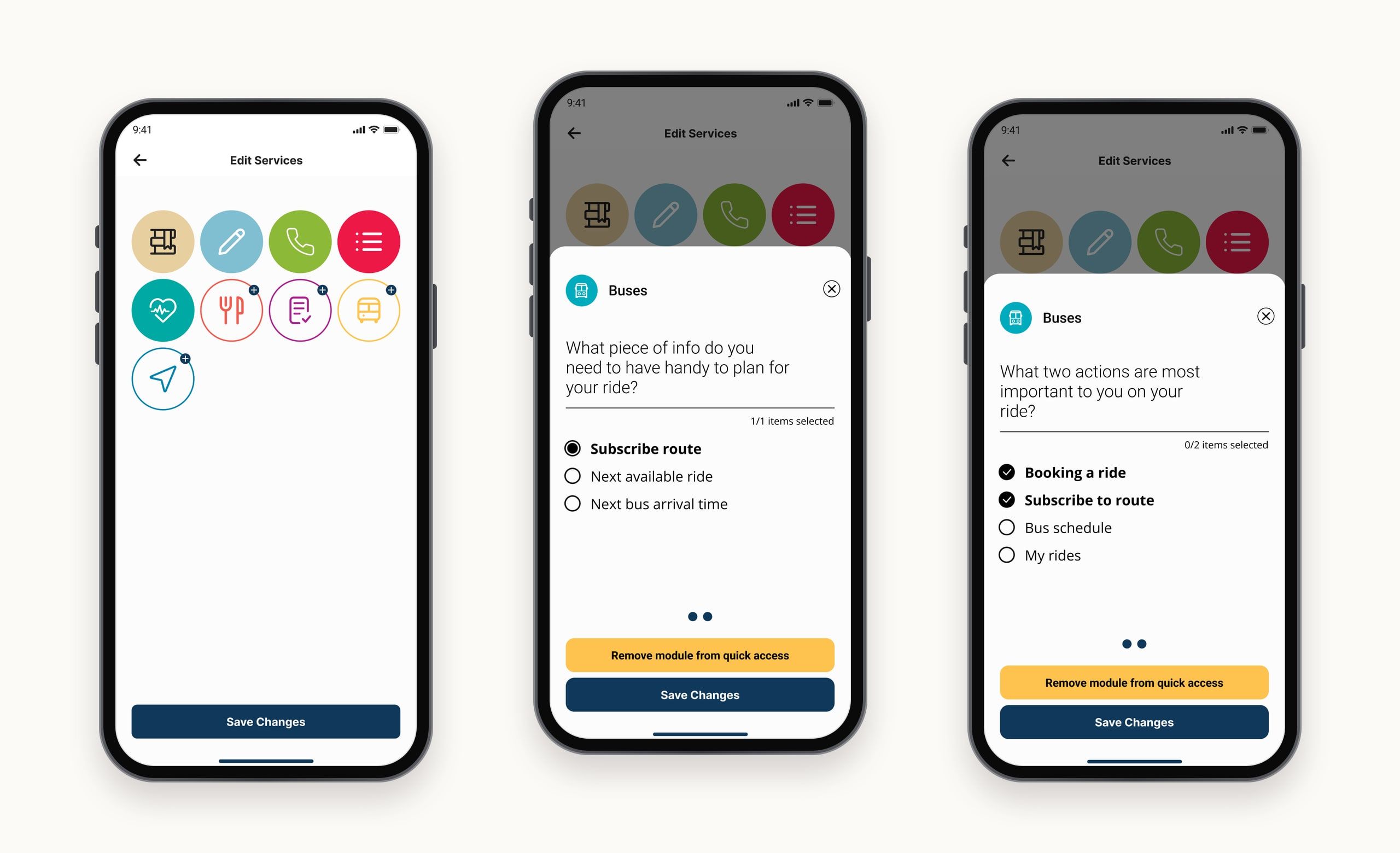
Customisation
From the home screen or the side menu, people can change which modules appear on their home screen, the quick actions for each module, and the information each module shows.
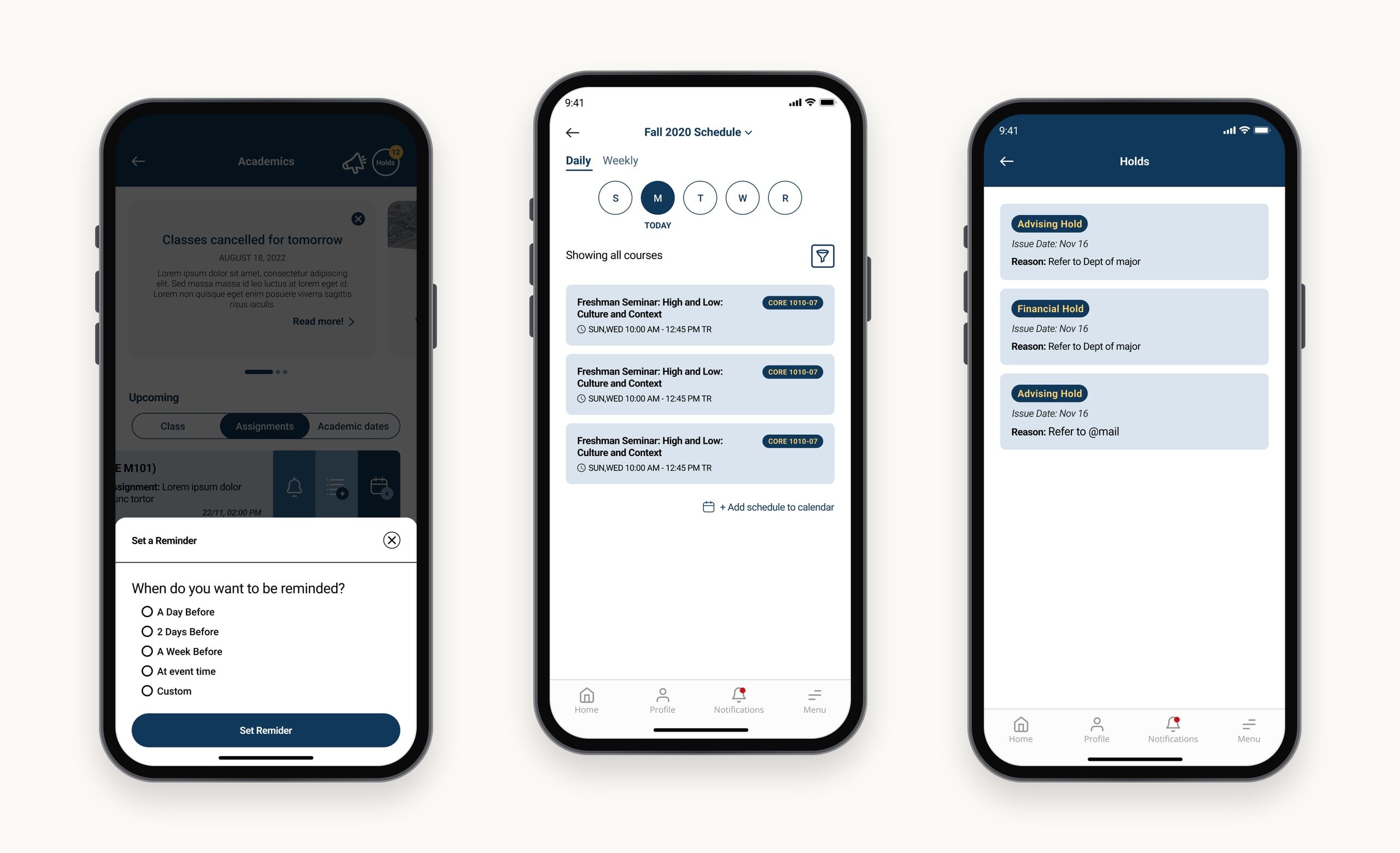
Academics
Students get their academic life in one place: upcoming assignments, class schedules and important dates, which they can add to their calendar. They can also see their holds, by type, and act on them.
- See upcoming classes, assignments and academic dates, and add them to the calendar or sync them with the to-do module.
- View GPA, earned hours, academic standing and past semesters’ grades.
- Set reminders for classes and assignments.
- See holds and take action.
- Read urgent announcements, which every module has room for.
- Open linked academic apps, like Blackboard and Self-Service Banner.
The module’s settings control syncing with the phone calendar or the to-do module, and hold all announcements and tutorials.
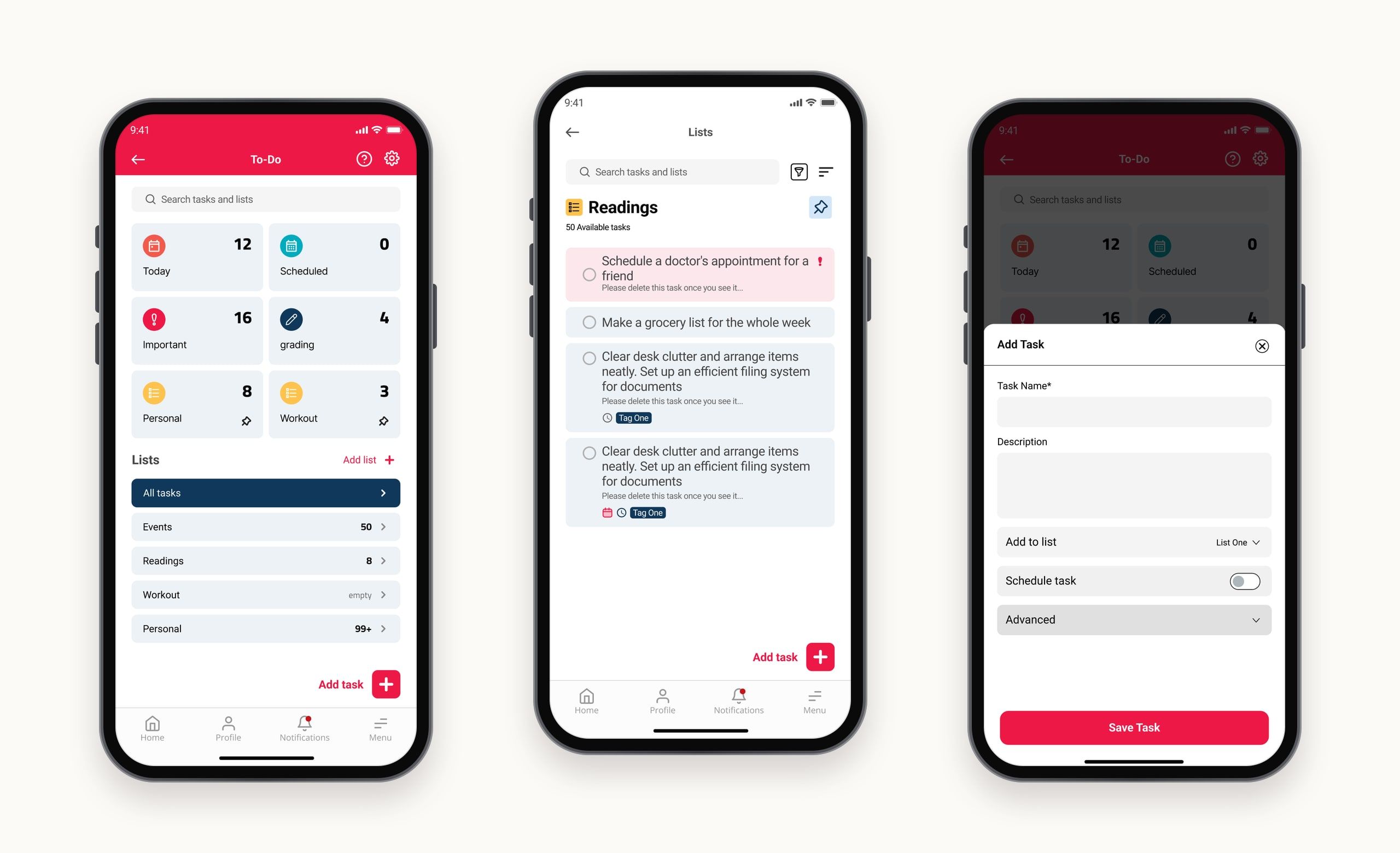
To-do
The to-do module helps people manage their tasks: create them, set reminders, schedule them and tag them. It’s integrated with academic events, so important deadlines land in the task list automatically.
- Schedule a task.
- Mark a task as important.
- Add a reminder to a task.
Task life cycle
A task can be marked done at any time. People choose whether completed tasks are hidden or kept at the bottom of the list, and when they’re deleted. The first visit opens a short tutorial.
Library
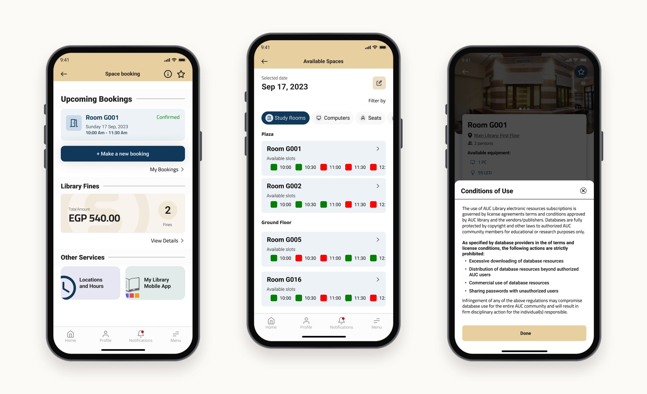
The library module lets people reserve spaces in the university library for study and research, keep track of any library fines, and check opening hours to plan their visits.
Space booking
Pick a day and a type of space to see the available slots, then book up to three time slots.
Navigation
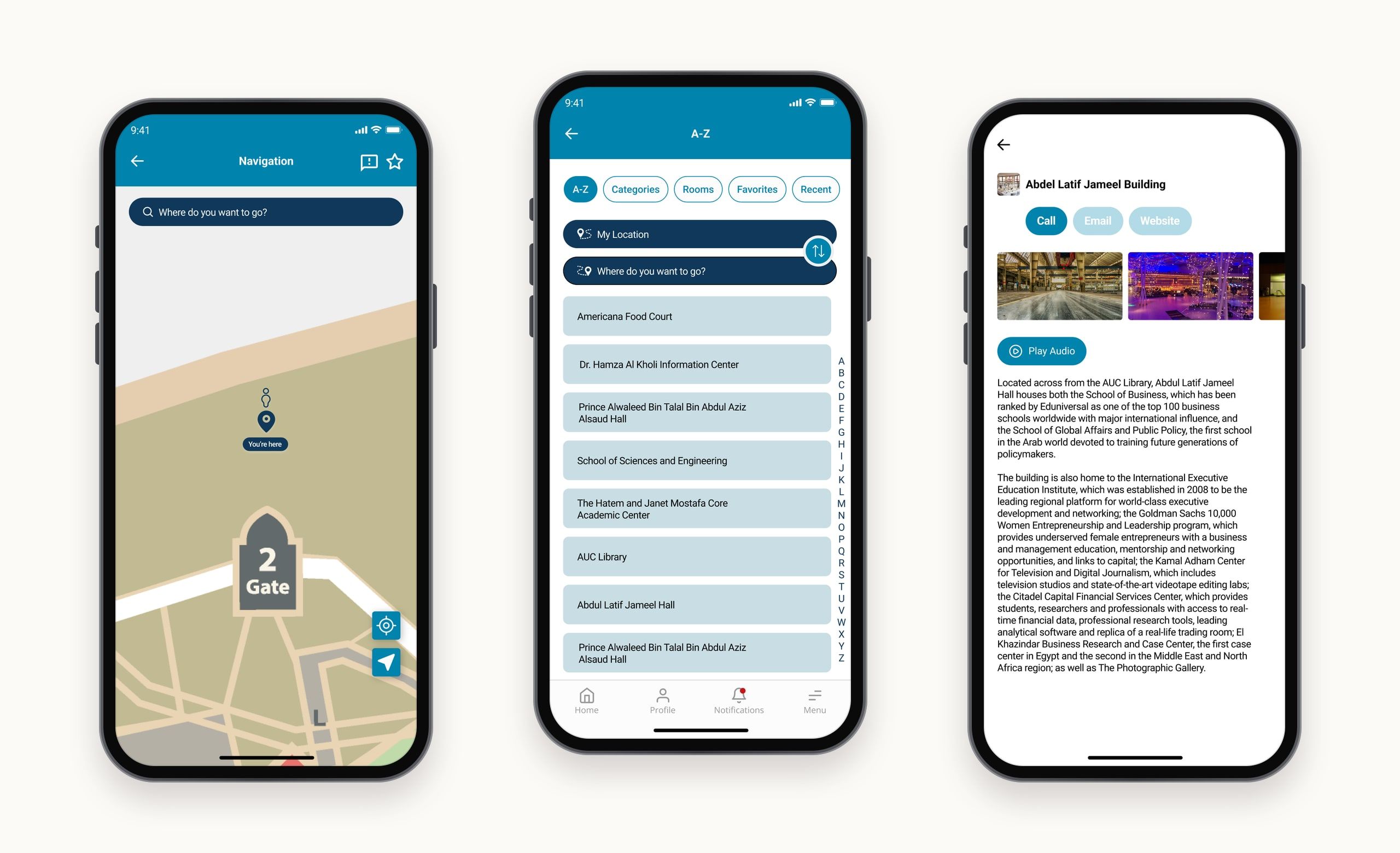
The navigation module helps students find and get to any spot on campus, with indoor and outdoor directions. Favourite spots and custom names make frequent places quick to reach.
- Search and navigate to any spot, from the current location or another spot.
- Indoor and outdoor directions, inside buildings and across campus.
Dining
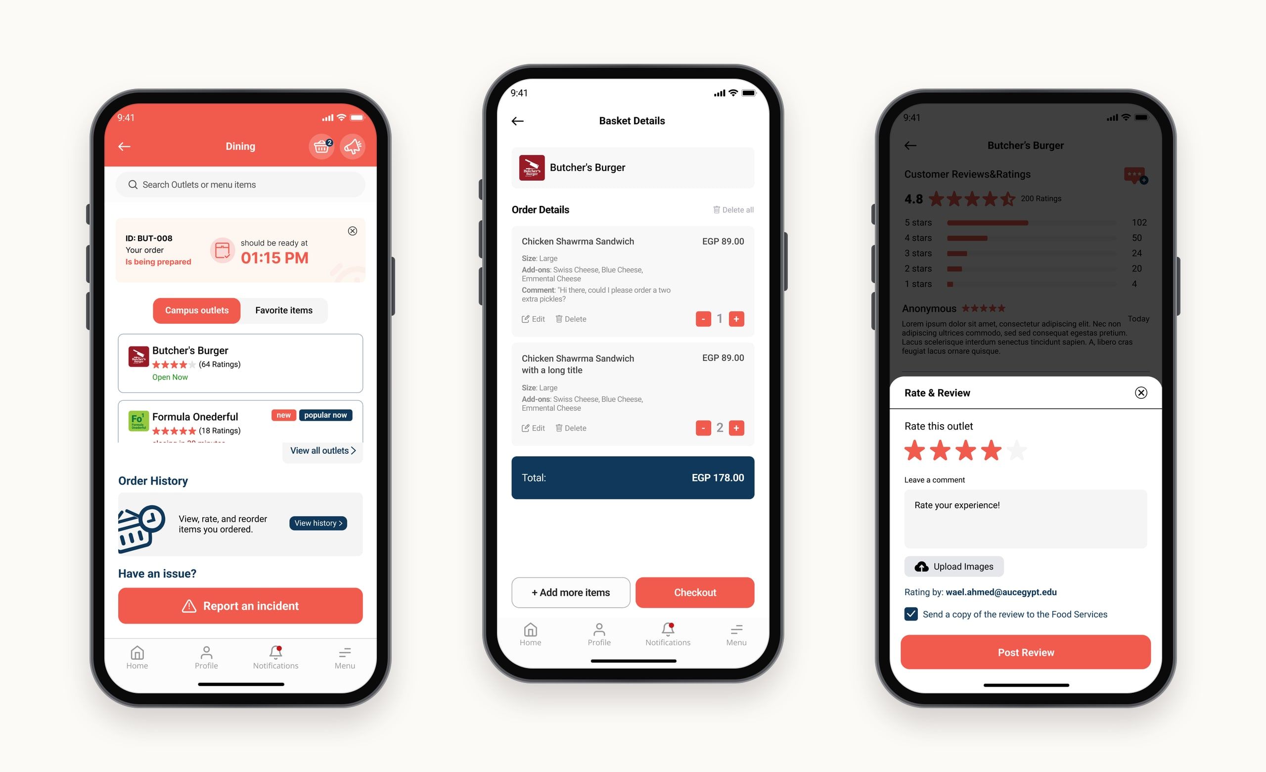
The dining module brings outlets, menus and ordering into the app, so people can order ahead and pick up their food when they’re free. A short tutorial guides first-time users.
For admins, an analytics view tracks the ordering funnel, from active users to those who visit dining and those who complete an order.
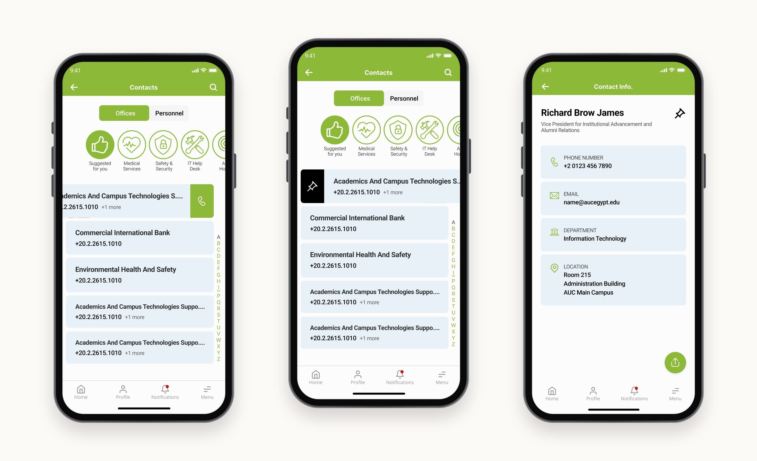
Contacts
The contacts module makes it easy to find the right contact details, and to get technical help from the IT bot.
- Swipe right to pin a contact.
- Swipe left to call a phone number.
- Chat with the IT bot.
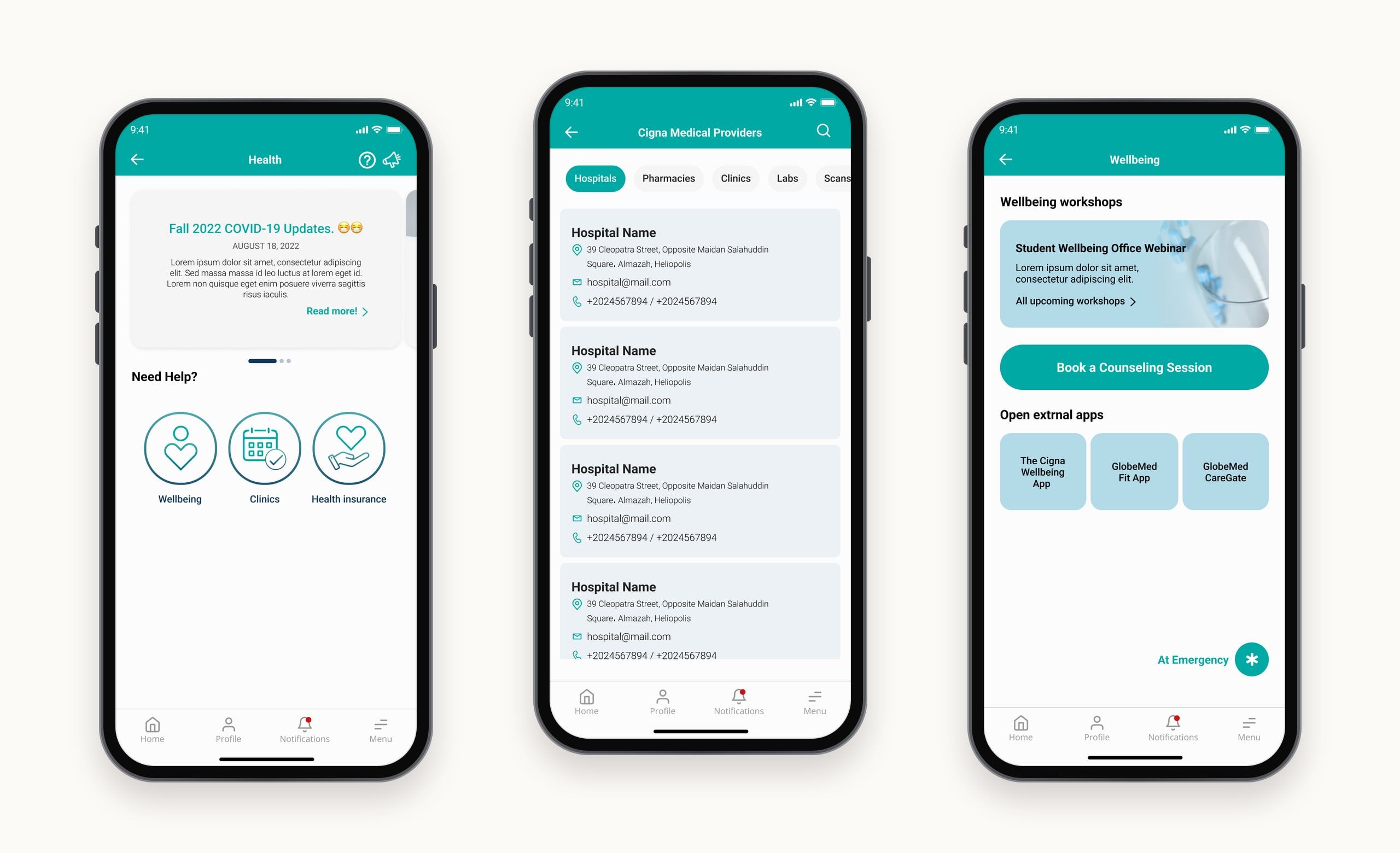
Health
The health module supports people’s care and wellbeing: booking a clinic visit, understanding insurance coverage, and joining wellbeing events on campus.
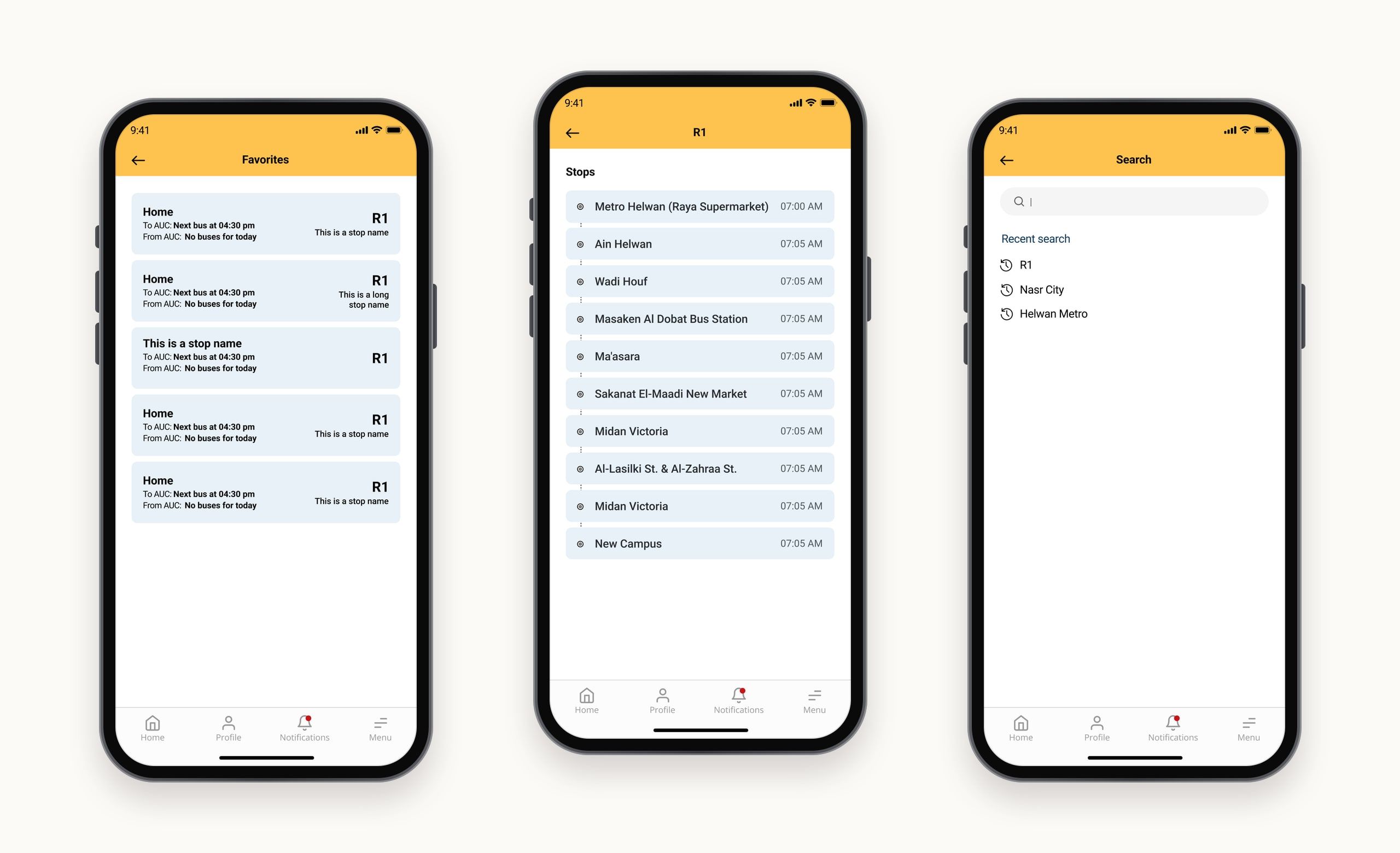
Buses
The buses module helps people plan their trips to and from campus, with route listings, round information and stops.
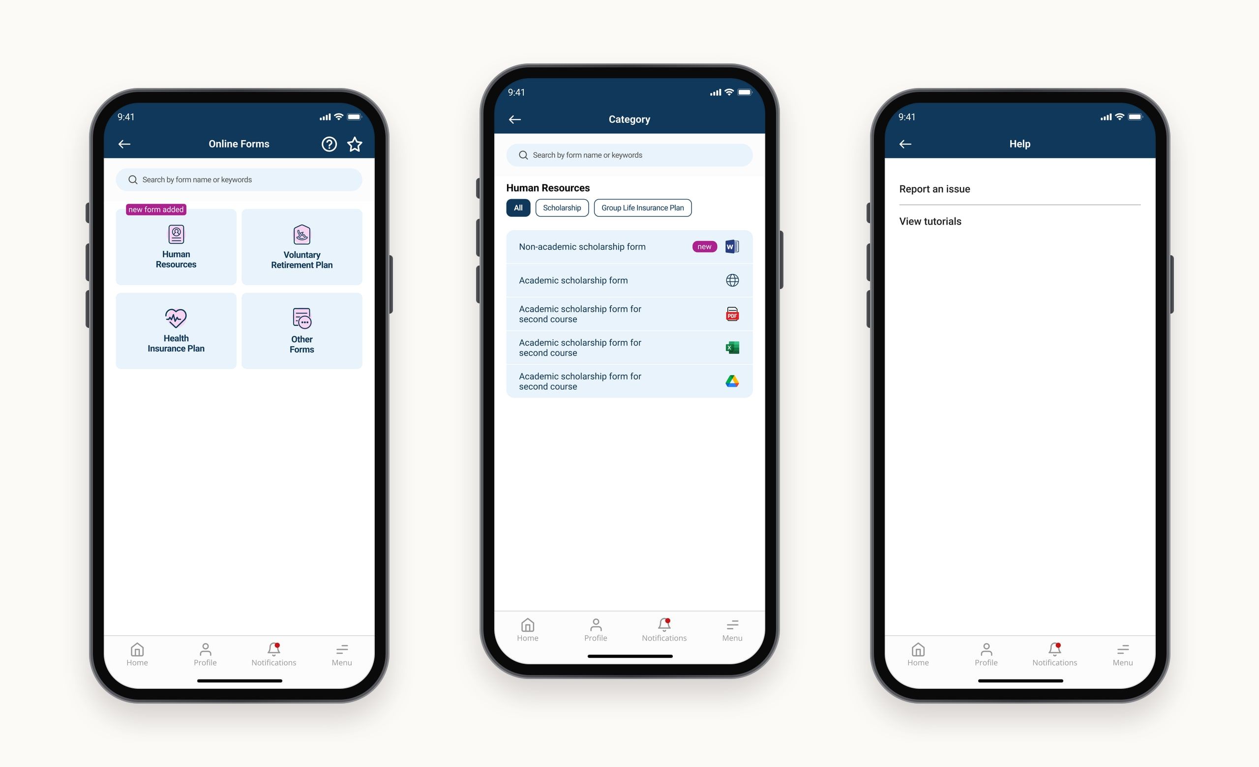
Online forms
The forms module puts every form in one place, organised into categories and subcategories, so people can find the one they need and submit it easily.
From Figma to OutSystems.
Beyond designing the screens, I built the UI components and custom theme directly in OutSystems, so developers could reuse ready-made components, which reduced handoff time.
Impact
- Downloads on Google Play
- 10K+
- Screens designed across 11 modules
- 200+
- Of 106 students chose the winning home screen
- 59%
Final notes
MyAUC is the largest project I've worked on, with 11 modules, 200+ screens and four very different groups of people sharing one app. Two things shaped it most. Testing three home screens with students and staff turned a matter of taste into a clear choice, and building the components and theme in OutSystems myself kept the shipped app close to the designs instead of letting them drift in handoff. Next time, I'd bring that kind of testing in earlier, on the flows as well as the look.