Case study · E-commerce · Mobile
iMarket
iMarket is a client's mobile marketplace, built around stores rather than products, and this is my redesign of it. Shoppers follow what stores post, chat with them and order from them, and any user can open a store, list products and manage orders, all in one app.
At a glance
- The problem
- The client wanted its existing app redesigned, as one place where shoppers follow stores, chat with them and order from them, and where any user can open a store and start selling, without a separate app for sellers.
- What I did
- Redesigned the app end to end in two weeks, from onboarding and the store feed to browsing, buying, opening a store, listing products and handling orders, with a guided tour and a small design system.
- The result
- A complete redesign of the app, from the first launch to running a store.
Project timeline
- Shopping, selling and the design systemWeeks 1–2
Connect, order, deliver.
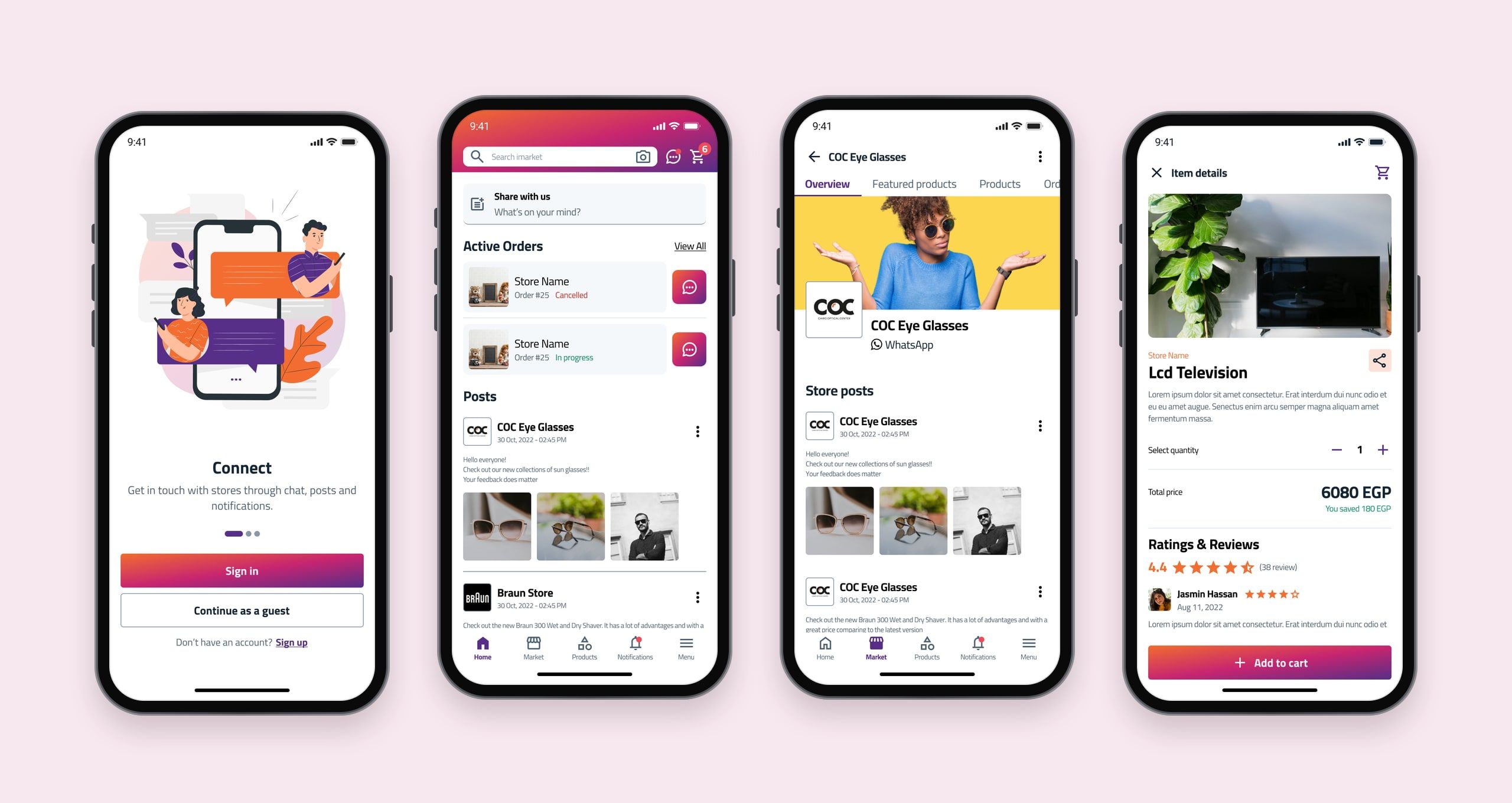
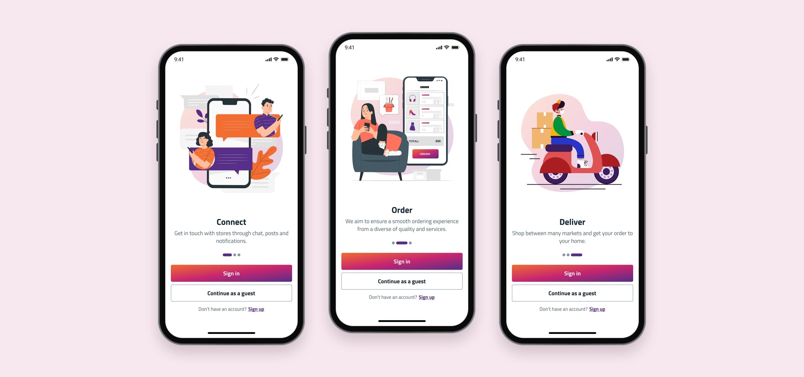
The first screens tell the whole story in three words. Connect with stores through chat, posts and notifications; order from a wide range of stores and services; and get it delivered home. People can sign in, sign up, or simply continue as a guest and look around first.
A feed of stores, not a catalogue.
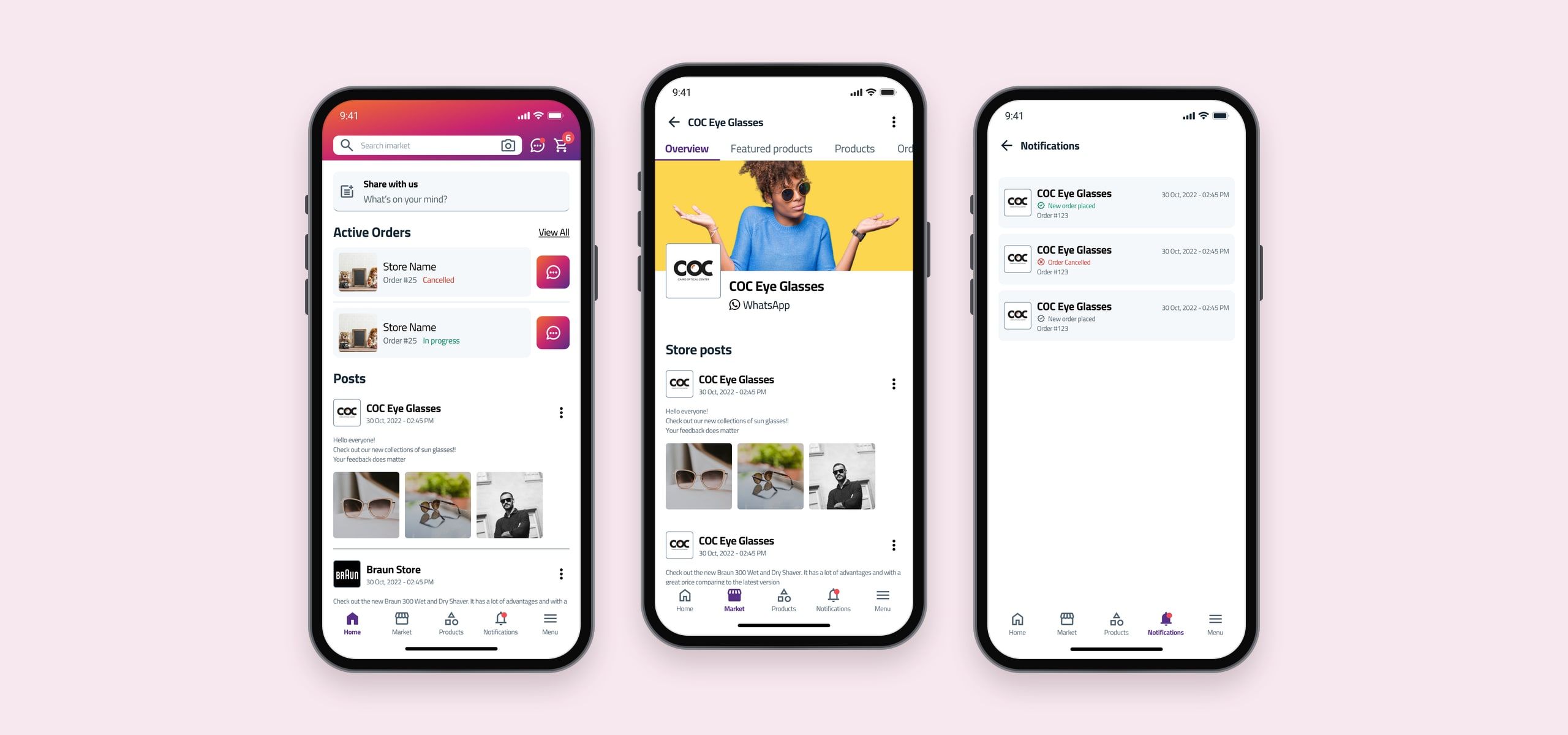
Home opens with a box to share a post, then the orders in progress, each with a button to chat with the store about it, then posts from stores. Every store has its own page, with its cover, a WhatsApp link, its posts, products and orders. Notifications bring order updates and new posts together.
Find it, check it, add it.
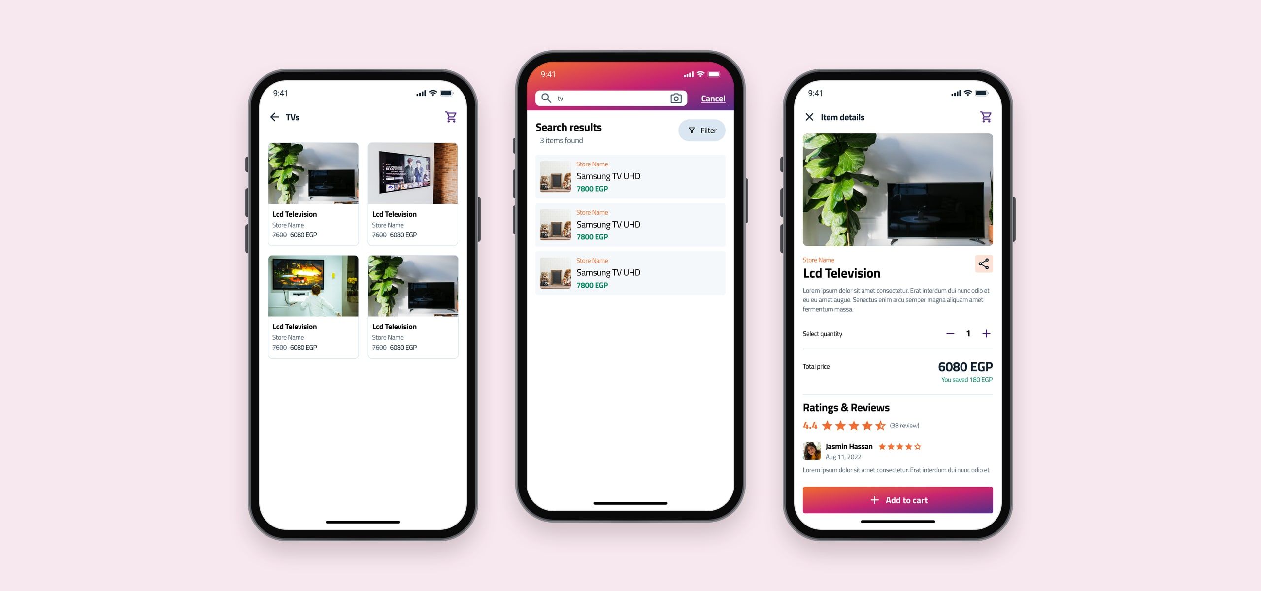
Products can be browsed by category or found by search, with a camera button beside the search box. Each one shows its store, price and any saving, a quantity picker, and ratings and reviews, with Add to cart always in reach at the bottom.
Open a store in minutes.
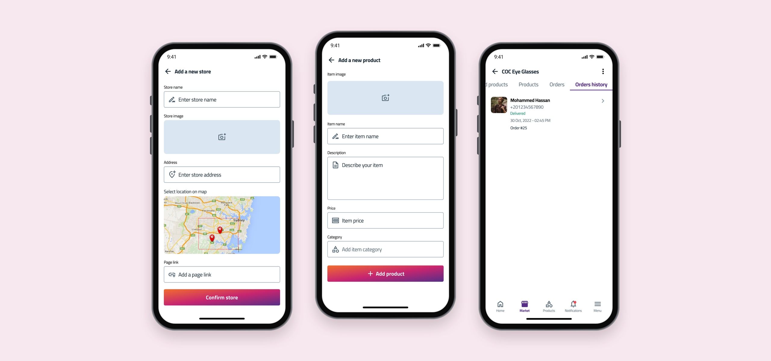
Selling is part of the same app. Opening a store takes a name, an image, an address and a pin on the map, and an optional page link. Products are added with a photo, a name, a description, a price and a category, and each store keeps a history of its orders with the buyer’s details and status.
A tour on the real screens.
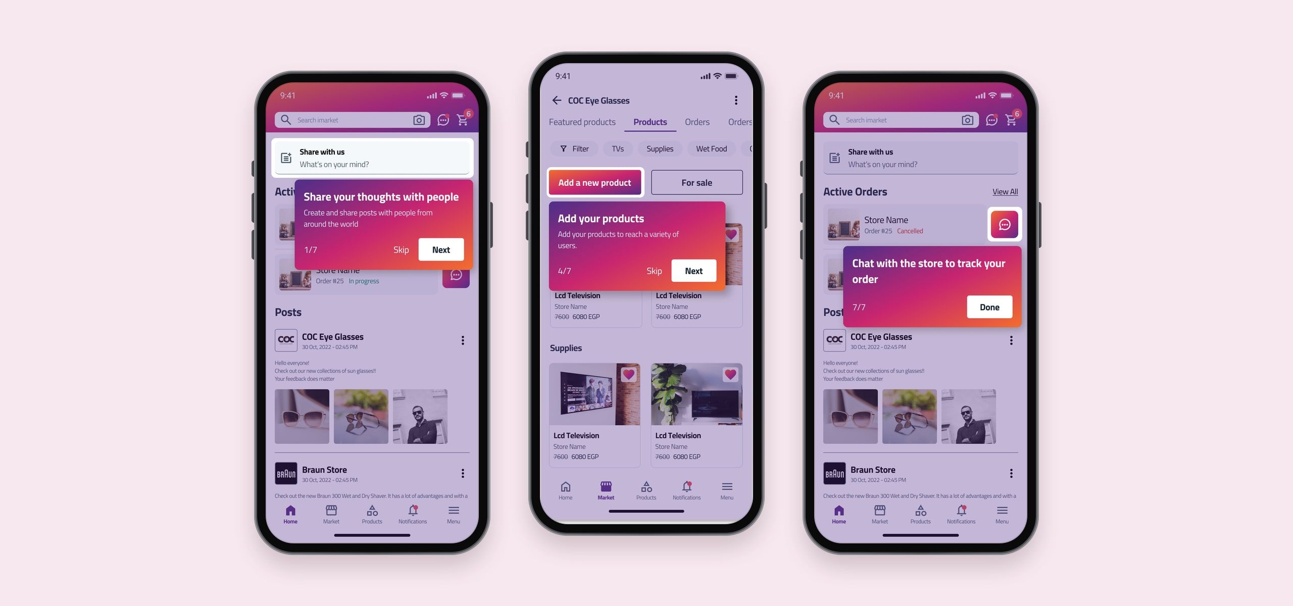
Instead of a long tutorial before people start, a short tour runs on the real screens. Seven steps point out what matters, from sharing posts and adding products to chatting with a store to track an order, and any of them can be skipped.
Everything else, in one menu.
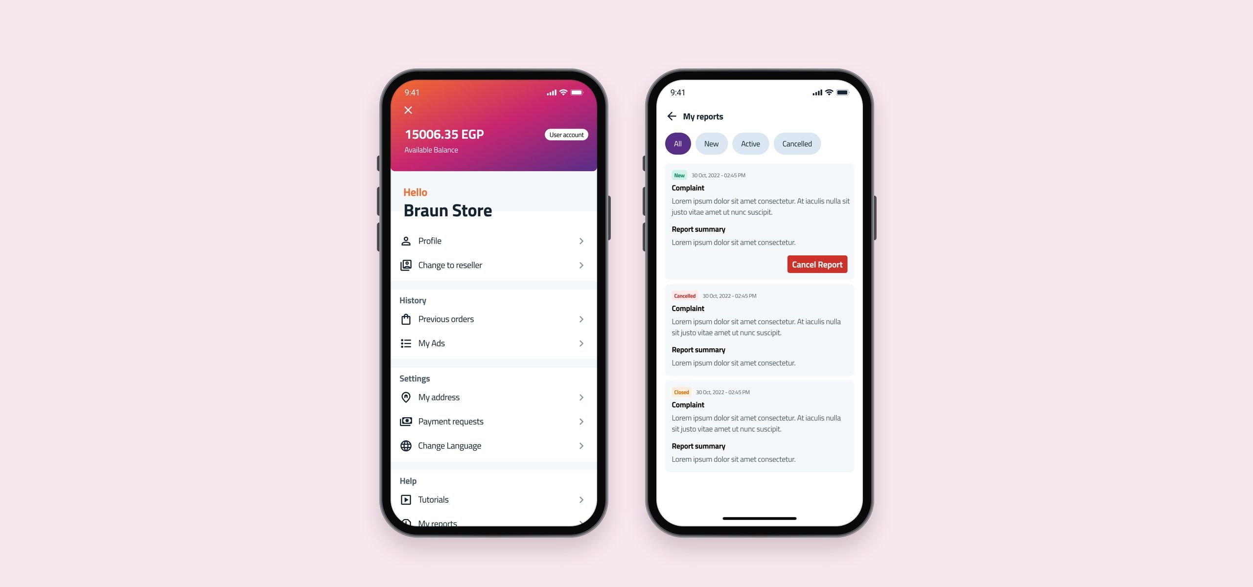
The menu gathers the account in one place: the available balance, profile and switching to a reseller account, previous orders and ads, addresses, payment requests and language, and help, from tutorials to reports. Reports can be filtered by status, and a new one can still be cancelled.
Colour and type.
A gradient from purple through magenta to orange carries the brand, on buttons, headers and the tour, with purple and orange as solid colours on their own. A scale of blue-greys handles text and surfaces, and green, amber and red carry status. Cairo sets everything, from 32px headings to 10px labels.
Brand
- Primary#572F88
- Gradient#C82671
- Secondary#F36D30
Neutrals
- Darkest#142533
- Dark#506373
- Medium#8799A8
- Light#DAE7F2
- Lightest#F5F8FA
Status
- Success#078C64
- Warning#D67200
- Error#CC3229
Cairo
Typeface
- RegularConnect, order, deliver
- BoldConnect, order, deliver
Impact
- Redesigned end to end
- 2 weeks
- Steps in the guided tour
- 7
- App for shopping and selling
- 1
Final notes
The idea that shaped every screen was that a store is something you follow, not a page you search for. So the home screen is a feed of posts from stores, active orders sit at the top with a chat button beside each one, and selling uses the same app as buying. Anyone can switch from shopping to running a store without learning a second product.